The other day I was watching Michelle Barker's talk on CSS Day 2022 where she showed a neat trick with grid and content length selectors.
Turns out you can use the :has() selector to do a lot of cool things! In her examples, Michelle shows how to create a grid layout that adapts to the length of the content.
She starts with a pretty simple 3 column grid layout:
.grid {
  --cols: 3;
  display: grid;
  grid-template-columns: repeat(var(--cols), 1fr);
  gap: 1rem;
}
Pretty simple, right? But what if we want to add one more element to the grid?
That's a bit awkward, isn't it? Now let's introduce the :has() selector to the mix:
.grid:has(:last-child:nth-child(even)) {
  --cols: 2;
}
Now the grid adapts to the content length! Pretty cool, right?
How does it work?
Let's look at the different parts of the selector:
:last-childtargets the last child of the parent element.:nth-child(even)targets every even child of the parent element.
So effectively, we're targeting the last child and it must be even. Next we add the :has() selector to the mix:
:has()targets the parent element that contains the specified selector.
Combining all of these, we're targeting the parent element that contains a even last child.
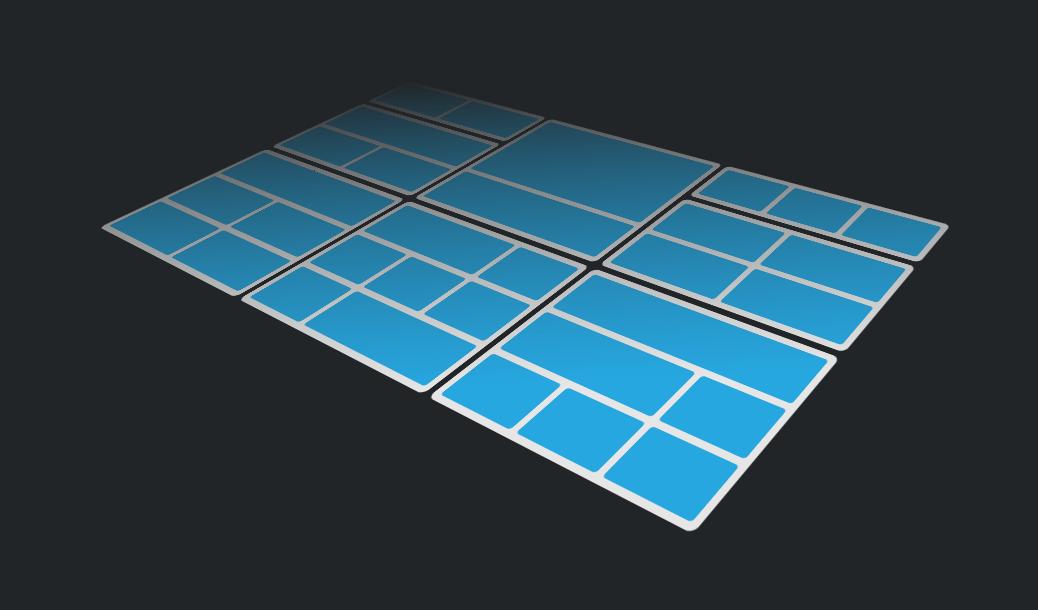
Now that we know how to target length-based selectors, we can do a lot of cool layouts with this technique.
More examples
Let's expand on this technique and create a few more examples.
2 column grid with hero
.grid:has(:last-child:nth-child(5)) {
  --cols: 2;
}
.grid:has(:last-child:nth-child(5)) .square:first-child {
  grid-column: span 2;
}
3 column grid with 2 hero elements
.grid:has(:last-child:nth-child(6)) {
  --cols: 3;
}
.grid:has(:last-child:nth-child(6)) .square:first-child {
  grid-column: span 3;
}
.grid:has(:last-child:nth-child(6)) .square:nth-child(2) {
  grid-column: span 2;
}
3 column grid with hero elements at start and end
.grid:has(:last-child:nth-child(7)) {
  --cols: 3;
}
.grid:has(:last-child:nth-child(7)) .square:first-child {
  grid-column: span 2;
}
.grid:has(:last-child:nth-child(7)) .square:last-child {
  grid-column: span 2;
}
1 column grid with hero element
.grid:has(:last-child:nth-child(2)):has(:first-child.hero) {
  --cols: 1;
}
.grid:has(:last-child:nth-child(2)) .square.hero {
  grid-row: span 2;
}
2 column grid with hero element
.grid:has(:last-child:nth-child(3)):has(:first-child.hero) {
  --cols: 2;
}
.grid:has(:last-child:nth-child(3)) .square.hero {
  grid-column: span 2;
}
And that's it! I hope this has peaked your curiosity and you'll try out this technique and come up with some cool layouts!