A couple of months ago I created a navigation bar for TaDone as a means of navigation for the child profile. Today I want to share it and guide you through the process of creating it.
From idea to code
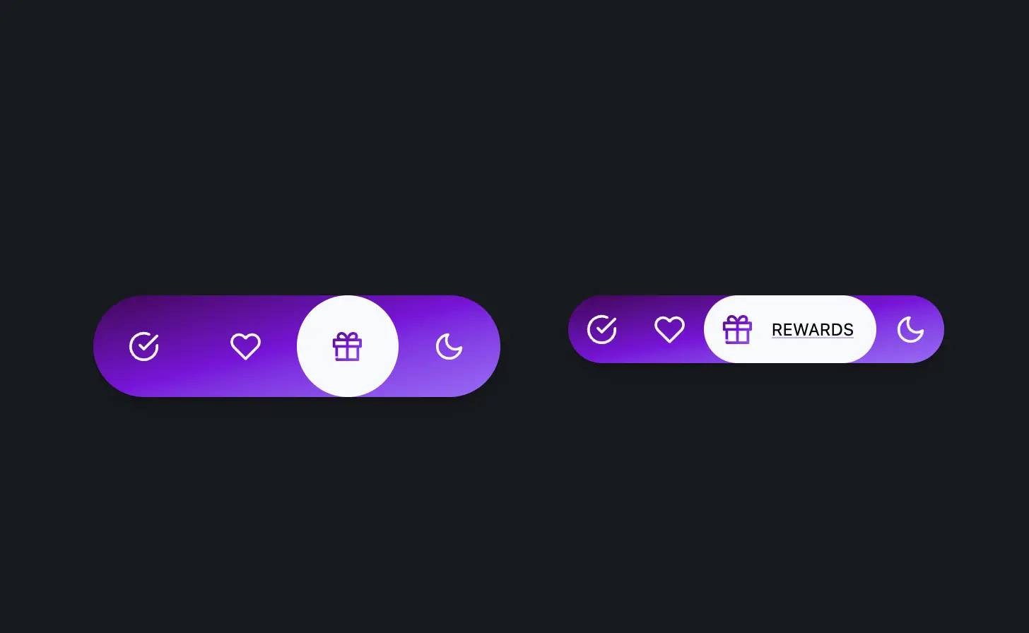
Think of this as a tab bar replacement. It sits at the bottom of the screen and allows you to navigate between different sections of the app. At the time I wanted to create something fun and colorful for children.
Accessible by design
One of the priorities was for it to be accessible. I wanted screen reader users to be able to use it without any issues. So I knew I had to keep the labels just like a tab bar. However I made it so that on devices with hover support, the labels would be shown as tooltips.
With the understanding that tooltips may not be easy to trigger for some users, I made the interaction area larger. This way, reducing the dexterity required to trigger the tooltip. Another thing I did was to make the tooltip appear on focus as well. This way, keyboard users would be able to see the tooltip when they navigate to the button using the keyboard.
On touch devices, only the label for the currently selected tab is shown. This was a stylistic decision knowing that the user would need to tap through the tabs to see the labels. To me it seemed like a good trade off. However, this is a trade-off that may affect accessibility and UX for first-time users, since the labels aren’t visible until interaction.
Code driven by design
Let's explore each block of code and see how it all comes together.
The HTML
Each tab is a link that contains an icon and a label. The label is visually hidden by default.
<nav>
    ...
    <a id="l4" class="nav-link" href="#4">
        <div class="icon icon-moon-zzz"></div>
        <span>Sleep</span>
    </a>
    ...
</nav>
As you can see, this is a pretty simple structure. And thus it keeps the HTML accessible and easy to style.
Using <a> tags ensures native keyboard and screen reader support. You could also consider <button> elements if this wasn’t linked navigation.
Bringing it to life with CSS magic
The CSS is where the magic happens!
nav {
  display: flex;
  background: var(--gradient-2);
  border-radius: var(--radius-round);
  box-shadow: var(--shadow-2);
}
For the nav bar itself, I used a flex layout and a gradient background.
.nav-link {
    border-radius: inherit;
    text-decoration: none;
    outline-offset: var(--size-2);
    transition: background 0.25s var(--ease-3),
      backdrop-filter 0.25s var(--ease-3);
    &.active {
      background: var(--gray-0);
      .icon {
        background: var(--gradient-2);
      }
    }
    .icon {
      background: var(--gray-0);
      --icon-size: var(--size-fluid-3);
    }
    &:focus-visible:not(.active) {
      background-color: hsl(0 0% 100% / 0.3);
      backdrop-filter: saturate(1.5);
    }
}
This is the base style for the links. Not much to see here. Just setting some visuals. Now let's see the implementation of the link with hover.
@media (pointer: fine) {
    .nav-link {
        padding: var(--size-4);
        position: relative;
        transition: background 0.25s var(--ease-3),
        backdrop-filter 0.25s var(--ease-3);
        span {
            position: absolute;
            display: block;
            opacity: 0;
            bottom: calc(100% + 1rem);
            left: calc(var(--size-2) * -1);
            text-align: center;
            min-width: 90px;
            transition: opacity 0.25s var(--ease-3);
            background-color: var(--gray-0);
            color: var(--gray-12);
            padding: var(--size-2) var(--size-3);
            border-radius: var(--radius-round);
            box-shadow: var(--shadow-3);
            &::before {
                content: "";
                position: absolute;
                top: 100%;
                left: 50%;
                transform: translateX(-50%) translateY(-60%) rotate(45deg);
                height: var(--size-4);
                width: var(--size-4);
                border-radius: var(--radius-2);
                background-color: var(--gray-0);
            }
        }
        .icon {
            transition: transform 0.25s var(--ease-3);
        }
        &:hover:not(.active) {
            background-color: hsl(0 0% 100% / 0.3);
            backdrop-filter: saturate(1.5);
        }

        &:hover span,
        &:focus-visible span {
            opacity: 1;
        }
    }
}
Let's break this down a bit. First we add a media query to check if the user has a fine pointer. This indicates whether the user is using a fine pointer device like a mouse or trackpad.
Then we absolute position the span to act as the tooltip. We add a small arrow using the ::before pseudo-element. And we add a opacity and background-color transitions to fade it.
Now to add some 'pop' to the tooltip, we can use a transform transition. Don't forget we need to take into account users that may prefer reduced motion. So we need to add a media query to check for that.
@media (prefers-reduced-motion: no-preference) and (pointer: fine) {
    .nav-link {
        span {
            bottom: unset;
            top: calc(var(--size-2) * -1);
            transform-origin: bottom center;
            transition: transform 0.25s var(--ease-bounce-1), opacity 0.25s var(--ease-3);

            &::before {
                z-index: -1;
            }
        }
        &.active {
            view-transition-name: --desktop-active-tab-item;
        }
        &:hover {
            .icon {
                transform: scale(1.5);
            }
            span {
                transform: scale(1) translateY(-100%);
            }
        }
    }
}
Did you notice how we do positioning adjustments only when the user doesn't have reduced motion? Yep that's right! We only introduce properties for this case here even though we could've defined some of them in the previous block. I've found this to be a good practice to follow. Why would we need transform-origin if we're not transforming the element? Adding it would only add more processing to the browser when a user may not even need it.
I've also introduced a view-transition for the active tab. This is a nice progressive enhancement that doesn't break browsers that don't support it and adds a nice touch to the ones that do.
@media (pointer: coarse) {
    .nav-link {
        padding: var(--size-2);
        display: flex;
        flex-direction: row;
        align-items: center;
        span {
            opacity: 0;
            position: absolute;
            pointer-events: none;
            transform: scale(0);
            transform-origin: left center;
            color: var(--gray-0);
            view-transition-name: none;
            text-transform: uppercase;
            font-size: var(--font-size-0);
            padding: var(--size-1) var(--size-2);
        }
        &.active span,
        &:focus-visible span {
            opacity: 1;
            position: unset;
            color: var(--gray-12);
            transform: scale(1);
        }
        &:focus-visible:not(.active) span {
            color: var(--gray-0);
            font-weight: 600;
        }
    }
}

@media (prefers-reduced-motion: no-preference) and (pointer: coarse) {
    .nav-link {
        &.active {
            view-transition-name: --touch-active-tab-item;
        }
        &.active span,
        &:focus-visible span {
            transition: transform 0.25s var(--ease-bounce-1), opacity 0.25s var(--ease-3);
            transition-delay: 0.2s, 0.25s;
        }
    }
}
And finally we arrived to the touch implementation. In here I leveraged the pointer: coarse media query to check if the user is on a touch device. I set position: absolute;, opacity: 0; and transform: scale(0); to the span. This way, the tooltip is hidden yet still accessible to screen readers. I also set pointer-events: none; to prevent the tooltip from being triggered by accident.
When the link becomes active we reset the position so that it becomes part of the normal flow.
Finally I added the media query to check for reduced motion. It adds the view-transition and a transition delay to be run after the view transition. The need for this is due to the fact that View Transitions API generates images to transition between states.
The final sprinkle
To finish it all off, the View Transitions API requires a bit of ECMAScript to be added.
window.addEventListener("hashchange", function () {
  // Add your logic here to react to the hash change
  const links = document.getElementsByTagName("a");
  document.startViewTransition(() => {
    for (let i = 0; i < links.length; i++) {
      const link = links[i];
      if (link.id.indexOf(window.location.hash.charAt(1)) != -1) {
        link.classList.add("active");
      } else {
        link.classList.remove("active");
      }
    }
  });
});
This code listens for hash changes in the URL and adds the active class to the link that matches the current hash. We make the changes to the DOM inside the document.startViewTransition() function so that the browser can take a snapshot of the current state, apply the changes, and then animate the transition between the two states.
Behold the poppin' nav bar!
The code in CodePen is designed slightly different from the one in this article due to the fact that I wanted to show desktop and touch interfaces side by side.
Improving the experience
I may end up changing this nav bar in the future. The fact that it doesn't display labels on touch devices is a bit of a bummer. I'm hoping to get some feedback from users to see if they find it hard to understand or not.
An improvement might be to show temporary labels on first load or after a long press, especially for onboarding.
Another disadvantage of this design is that it doesn't allow for more than 5 tabs and needs really small labels. This is particularly problematic for languages with longer words. One solution would be to use a different type of navigation altogether. For example, a side navigation bar or a drawer.
Conclusion
I hope you enjoyed this little exploration of the poppin' nav bar. I had a lot of fun creating it and I think it turned out pretty neat. If you have any questions or suggestions, feel free to reach out to me via any of the social links.